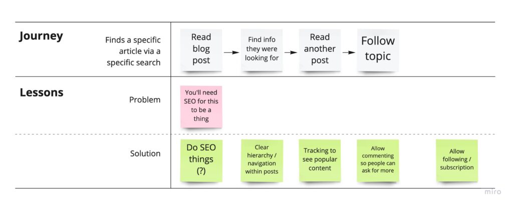
Some time in 2018 I asked my niece, who would have been about 7 years old at the time, to design a homepage for my website. I gave some requirements about what needed to be on there – a way to get in touch with me, a few images of the work I had done, and a title. On her first attempt, she created what can only be described as perfection:
Homepage design provided by my 7 year old niece
The title Design’s Tegan with fun really captures the fun that I’m having doing design, the logo ‘DT’, unintentionally reminiscent as it is of tiny men’s swimwear, and surrounded by cheeky hearts and stars, also alludes to that playfulness. It’s not just conveying to others the importance of fun in my work, it’s also a good reminder to me.
It’s hard to say whether the yellow guy is a straight-up monster or an early attempt at an existing creature that she can’t quite articulate yet, but he’s a recurring figure in her work of this period.
The presence of shooting stars and the moon seems to suggest to me a laidback spirit where things are taken in proportion. In this great universe we are insignificant, so the fact that there’s an easily editable spelling error on a website about ear cleaning that no one looks at is probably not worth yelling at the intern about, shall we dial it down a notch please.
Sheep and cats are an obvious inclusion, as well as the practical elements: A gallery containing only pictures of Ds (the fact that at age 7 she nailed this type of humour is a fortuitous accident), and a contact form. She’s credited herself with the design, she is no one’s fool.
I had fully resolved at the time to turn this work of genius into my website and never got around to it. Since I’m having (another) reassessment of what’s here, perhaps it’s time.
Before messing about with how to meet the needs I had identified, I wanted to map out my IA and be clear about what the changes were that I was hoping to achieve.
A map of the current information architectureA map of the updated information architecture with changes highlighted
The changes I’ve highlighted here are;
Date and summary should be displayed on the projects list page
Add preview text on the blog list page
Add ‘next’ and ‘previous’ navigation buttons to both detail pages
That doesn’t seem to quite cover it, so I also drew a few basic tables to think about how my content would work in greater detail:
Content map
This wasn’t that much help to me but it’s always nice to lay things out neatly. What it demonstrates is that in addition to the content type ‘projects’, it is also ideal that that content type has its own custom fields/ taxonomy. Which I think will be a little harder to achieve.
Next, I revisited my user journeys and pulled out the key functionality my users need:
I want to find and share a resume fast
I want to look at past work examples
I want to contact Tegan
I want to see if there is any new content
I want to browse blog content
I want to be notified when content is updated (stretch goal)
I had to consider the limitations and demands of my team (me):
Solid design and UX skills
Vintage front end development skills
Experienced with AEM and WordPress
Can add analytics tags but kinda need it to be more or less able to run itself without too much customisation
Very keen to learn
Finally, the constraints and demands of my client (also me):
Keep current domain, hosting idc
CMS should be free
Currently on WordPress, no complaints
Would be good to cross publish to social (?)
Everything should be trackable
SEO, eagh. Is google even relevant now that it’s so obviously anti-Australian? Side note, what an amazing opportunity for Australian tech companies if google pisses off. Like a massive hassle to go back to like 2003 but also how cute and fun to start again. Anywhoo, I’d prefer a plugin or somesuch for entering SEO keywords.
The next job is to look into some CMS options to see if it’s worth the move. The platforms I have the most intimate knowledge of are AEM which is of course not worth even a thought in this context, WordPress, which I’ve used at work and personally for about 8 years, and custom CMS’s that I’ve had to design. Since this is meant to be a learning experience, I decided to look at:
Squarespace
Drupal
Directus
I’ve been getting fairly aggressive advertising for Squarespace for the last few years so I thought I should see what the deal is. Drupal of course is the old classic, which I’ve worked with as a designer in the past but never been forced to properly get to know it. Directus is a headless CMS and the direction in which things are going these days and so I want to get to understand that a bit more too.
So you can look forward to some more detailed info on each of these at some point. Yay!
Actually, I changed site template a year or so ago and forgot to put the GA code snippet back in. Oops. So I’m not going to glean much from current site usage data. The good news is, it can only get better from here!
Through my purpose exercise, I identified four user groups:
Prospective employers
Cute friends and fam
Me
Randos looking for a specific thing that I happen to have
And then assigned these groups imaginary uses:
Prospective employers
Hiring managers -> View skills and past work
Recruiters -> Quickly access skills, resume, then contact details
Cute friends and fam -> Browse various / latest content
My boyf -> See and share literally everything immediately
Me -> Document learnings and develop a writing habit
Randos looking for a specific thing that I happen to have -> That specific thing, and maybe more on that topic
Then I fleshed it out a little further by turning them into archetypes. These are based on my experience as a hiring manager, and I asked Andy a lot of questions since he worked as a recruiter for several years.
I sketched out a basic version of the ‘ideal’ user journey for these groups.
Recruiter
User journey for a recruiter
Hiring Manager
Family
Randos
Me
What I learned
The thing I found most interesting was that the classic portfolio template that we all know and trust is seriously wrong for the job. I’m talking about a list of portfolio items with images and titles, and when you click on an item you view that item in detail.
I’m surprised to miss something so obvious, but I guess taking a proper look at this was the point of this. You can see from the journeys that a recruiter or prospective employer needs context for the portfolio items in order to choose which ones to dive into further. So this suggests that the list page should actually act more as a resume, where the key information is date and project / employer.
Another finding that was already pretty obvious was that there are two types of content and two different audiences for that content, and little overlap. Namely, recruiters are unlikely to give a shit about my travel photos, and friends and family are unlikely to delve into case studies. The only anomaly is of course Andrew who is frighteningly into everything that I do.
So what does this mean for my design approach? My primary goal is then to design for prospective employers and recruiters. I need to make it easier to find and share my resume, and I need to add context to my work examples. While designing, I’ll also have to balance the needs of this archetype against my own need for privacy.
The way that friends and family will potentially use this revolves more around content, so the main design consideration for this audience is that content should be discoverable and accessible. A stretch goal is to create a read-on effect and encourage serendipitous exploration through good topic tagging and chaining content together. The real effort here though is in the design of the content, which I I’ll address in another post.
The archetype of someone who is very interested in one thing I’ll shelve until it comes up – though that does mean I need to watch my analytics.
As for myself, a content strategy will also help me by making sure there’s always something to write about and make me stick to a schedule. I hope it won’t kill the pleasure for me too much, I’ll see how it goes and reassess if I have to.
So that’s it for my very brief UX discovery. Before I start designing, there’s a few more pieces to put into place. If I’m changing CMS it will give me a bunch of design considerations. Also my very unused coding skills could rein in my design ambitions. So next post, I’ll have another discovery but from a tech perspective.
I began by asking what the purpose of this website is. I mean, aside from “you kinda have to because you’re a UX designer”, what else? Why am I keen to make it more than just that? I did a short exploration on Miro. And probably because I’ve been working as a UX designer for twelvethousdy years, it uncovered some users as well as purposes.
A quick breakdown of why I’m doing this
An obvious finding points to the nature of the web. Online all the time (hosting service permitting), requires very little effort for the reader at the cost of a bit of effort by me. Meaning, it is a way to get in touch with me without getting in touch. It’s more approachable than a phone call, and a bit more meaningful than a social media post.
Through this exercise, I confirmed that there is a bit more to this than just maintaining a token web presence to assist my employability. I want to use it to document my experiences of the last few years, since opportunities to share have been limited. This is for myself as well as friendies and fam, where it can be hard to stay in touch with busy lives and different time zones.
Purpose of my site:
To build professional credibility
A source of information and action for prospective employers
For documenting professional and personal learnings
For sharing things I find interesting
That’s a start. I identified some users that I think I’ll turn into archetypes and make some journeys for. I’ll put those up next week.
It’s lazy, or efficient, to have your personal website on a WordPress template that someone else designed and built. In the case of the template I use, despite claiming to be a ‘minimalist’ template, in fact it has incredible flexibility built in, with about a million template options, and a million more plugins. So even though my homepage is three lines of text, it loads infuriatingly slowly. So I’ve decided to DIY it, however long it takes, and use it as an opportunity to mimic what goes on in some of the teams I’ve worked on, and get a broad idea of the tools and skills my colleagues have been using. So for now I guess I’m the client. And I have the easy and fun job of creating a brief.
The Brief
Redo your dumb personal website
New IA geared towards exploration, rather than straight to contact
Visual redesign
New content
No downtime bc time is money
No downturn in traffic (lol)
Criteria
Explore host and CMS options
Free user research only because we’re not made of money (IRL: there are no users, soo)
Site should champion the new Tegan brand
Best practice everything
Minimum one (1) spectacular (high effort) element
So, next post I’ll get to breaking this down into tasks and people.
Will this project be fun? It’s more likely to make me want to die. Will I come out with a better website? Almost certainly not. Will I learn something? Probably.
I read recently that the Prime Minister of my home country will not bother to self-isolate, despite being in contact with the actual COVID-19, and I have to say, after more than 7 weeks working from home on a small table with my gentleman friend (who has A LOT of meetings) on one side and the cat litter on the other, I’m not impressed. Here are the tips that Scomo isn’t giving you.
1. Shut. It. Down.
In an Australian suburb, a decent implementation of COVID-19 controls will require blocking both ends of your street (whatever section you care about) to car and foot traffic (important!). If people are worried about where to park, they can park anywhere on the road inside or outside the blockade. You won’t be needing roads anymore.
2. Who comes in and out?
An important question. Now you have your blockade established, people are going to want to walk through it. You need to get organised, fast. You’ll need guards at each end, and some administrative staff. Then you just need to ask all the residents and workers in your safe zone to prove that they live and/or work in your zone (provide ID and proof of residence, please). Then you can issue them with an official resident’s card (MS Word + home printer is fine). Residents should carry this card with them at all times. Any businesses on your street that aren’t to your taste are easily tidied up in this way, by simply denying some or all of the staff a permit.
Visitors to private residences, delivery drivers, couriers, babysitters, maids or care workers should not be allowed in. These people surely carry disease. Add an extra layer of security and keep your residents on their toes by having them add their phone number and signature to a book on occasion.
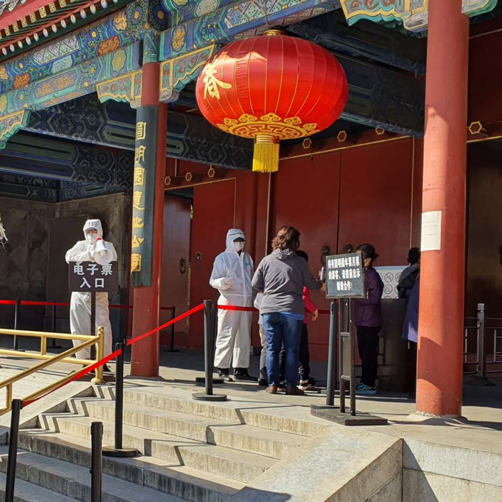
3. Temperature
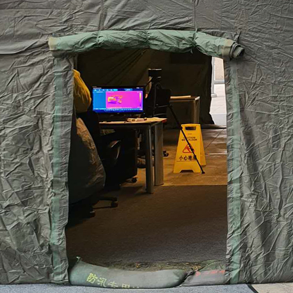
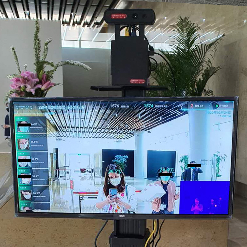
Check it. All the time. Everywhere. In addition to the entrances to your safe area, you may want to broaden your monitoring and station someone out the front of every workplace, pub, restaurant, school, public building, public toilet, apartment building, bus stop, train station and neighbourhood in the country. If there is a doorway you can’t patrol, barricade it. Give your neighbourhood security heroes a thermometer and a very simple guideline: all humans must be checked, and all humans must be below 37.3°C. Budget version of this is a simple laser thermometer, but if you want to impress, a thermal imaging camera will give any checkpoint that luxury feel.
(What happens if you leave the house in your pyjamas to grab a takeaway, and upon your return are found to be feverish? I don’t know, and I don’t want to find out.)
Classic style
Workers using a laser thermometer on Old Summer Palace visitors
An infrared camera inside a decontamination tent
Infrared camera
Walk through this tent to get to the shops
Image of the author taking a photo, viewed on a heat sensing monitor
Infrared with feedback
How it should be done at work
4. Delivery
On the topic of picking up takeaway. Now you have successfully prohibited people from getting items delivered to their doors, and are making them walk a block to sift through all their neighbours’ mail and rapidly cooling fast food, desperately turning blinders on to any especially appealing bounty (new TVs and laptops for example), you should congratulate yourself. Not only is it an opportunity to keep pesky germs out of the neighbourhood, you can also get a sense of what and how much is being delivered. Have your security staff keep a record if you like! Most importantly, it’s an opportunity for a temperature check on someone that may otherwise have just stayed indoors.
If you’re in an city that’s under heavy surveillance, be sure to put the area where deliveries are collected in a CCTV blind spot. When deliveries go missing (and they will!), remind people that there’s no surveillance and it’s not your responsibility.
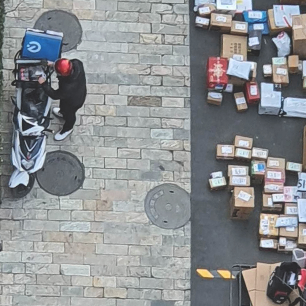
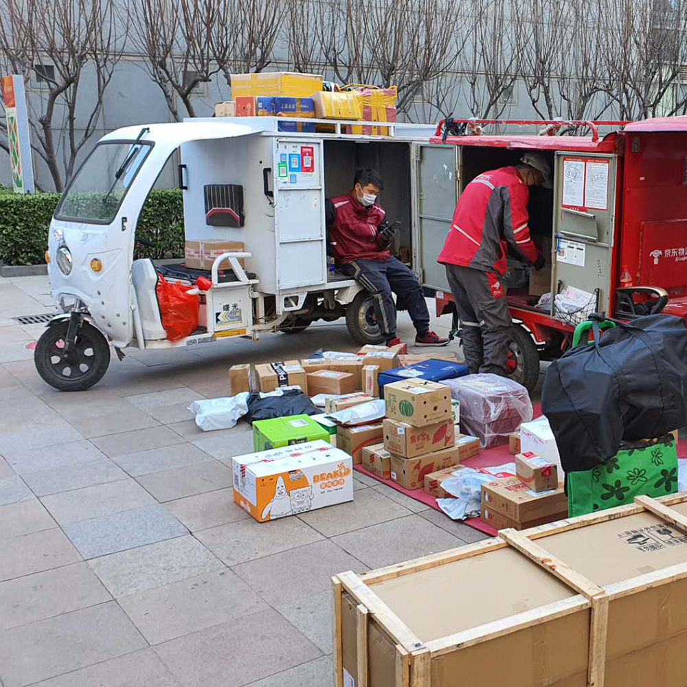
Parcel dropoff zone
Kuadi driver unloading parcels
One delivery driver unloads parcels from his van onto a rug on the ground while another sits and looks on
Kuadi drivers
Delivery drivers chilling and unloading
Parcels piled up by building number in front of the gate to the residential compound
很多跨地
Parcels piled up in front of the compound
5. You can’t have too much safety
This is where things get exciting. You can kick some serious safety goals. You’ve already told everyone to wear a mask, but there’s so much more you can do to make it super safe.
a) Set up a bleach tent. You’ve already ensured there’s only one (maximum two) routes in and out of your neighbourhood. Why not redirect all your foot traffic through a plastic marquee, in which you’ve set up a makeshift gas chamber? Given how simple it is to DIY with cheap and accessible materials, there’s no reason not to.
Materials
Plastic sheeting
Scaffolding
Household humidifiers (1 per square meter of interior space)
Bleach (shitloads)
Our friendly neighbourhood bleach tent
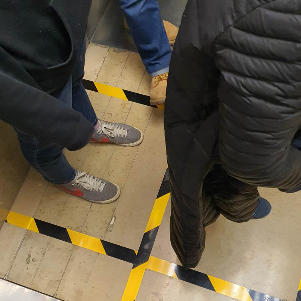
b) Elevators are the enemy. They may be lined entirely of stainless steel, but don’t be fooled, they are disease boxes. Your team is disinfecting them twice daily, but people continue to use bare fingers(!) on the buttons. Try taping a foam block to the wall, and pushing some toothpicks into it. Elevator passengers can push the button without making contact, and then discard the used toothpick. Tissues serve this purpose just as well. Make sure to give them somewhere for used ones.
Too many people using elevators at one time? Create a safety grid on the floor to ensure the correct maximum number of passengers and the right space between them.
c) Foreigners. Sure, it’s a global pandemic, and it could be said that we’re all in this together. It could be said that now, more than ever, humankind is one through our shared vulnerability. If the virus won’t discriminate, it’s up to you. If you’re already uncomfortable with people from outside your birth country, this is a great time to make a show of your xenophobia. Perhaps there are some foreigners in your safe zone? Check them more often, and more diligently. Go to the door of every foreigner in your neighbourhood and just, you know, take a photo of them. Talking to a foreigner you haven’t met before? Ask them if they underwent quarantine when they arrived. Don’t worry how long ago they arrived, or where the disease originated from. Just lean right on in to your fear.
You too can use your resourcefulness and creativity to make sure that regardless of what COVID-19 really means, that it touches every aspect of every human’s life. Many people are already doing a great job of impacting other people’s daily lives by buying more toilet paper than they need, and creating a shortage in the name of the disease. Keep it up! Maybe some people will mistake this global event for ‘just a virus’. Some people might not even be afraid. But not in your backyard.