

Site upgrade | 3. Users and uses
There aren’t any users.

Actually, I changed site template a year or so ago and forgot to put the GA code snippet back in. Oops. So I’m not going to glean much from current site usage data. The good news is, it can only get better from here!
Through my purpose exercise, I identified four user groups:
- Prospective employers
- Cute friends and fam
- Me
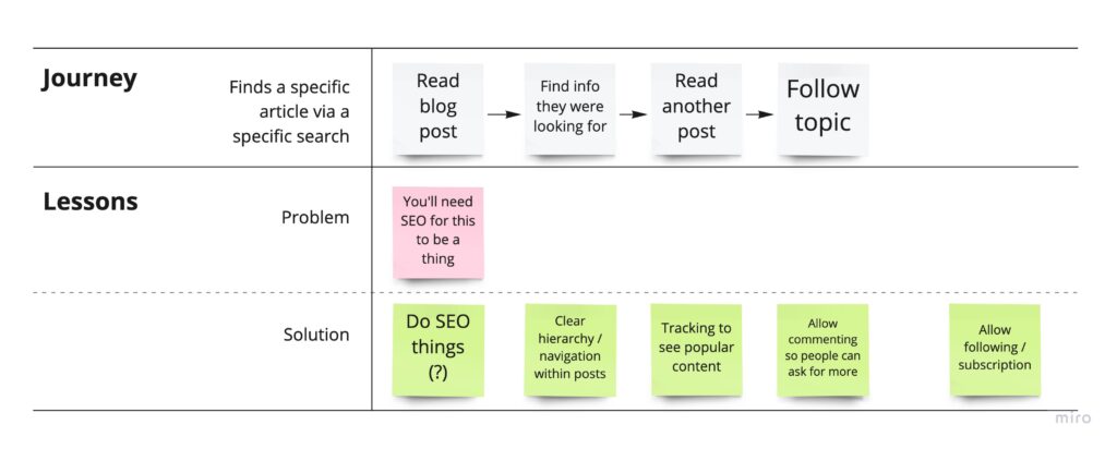
- Randos looking for a specific thing that I happen to have
And then assigned these groups imaginary uses:
- Prospective employers
- Hiring managers -> View skills and past work
- Recruiters -> Quickly access skills, resume, then contact details
- Cute friends and fam -> Browse various / latest content
- My boyf -> See and share literally everything immediately
- Me -> Document learnings and develop a writing habit
- Randos looking for a specific thing that I happen to have -> That specific thing, and maybe more on that topic
Then I fleshed it out a little further by turning them into archetypes. These are based on my experience as a hiring manager, and I asked Andy a lot of questions since he worked as a recruiter for several years.
I sketched out a basic version of the ‘ideal’ user journey for these groups.
Recruiter

User journey for a recruiter
Hiring Manager

Family

Randos
Me

What I learned
The thing I found most interesting was that the classic portfolio template that we all know and trust is seriously wrong for the job. I’m talking about a list of portfolio items with images and titles, and when you click on an item you view that item in detail.
I’m surprised to miss something so obvious, but I guess taking a proper look at this was the point of this. You can see from the journeys that a recruiter or prospective employer needs context for the portfolio items in order to choose which ones to dive into further. So this suggests that the list page should actually act more as a resume, where the key information is date and project / employer.
Another finding that was already pretty obvious was that there are two types of content and two different audiences for that content, and little overlap. Namely, recruiters are unlikely to give a shit about my travel photos, and friends and family are unlikely to delve into case studies. The only anomaly is of course Andrew who is frighteningly into everything that I do.
So what does this mean for my design approach? My primary goal is then to design for prospective employers and recruiters. I need to make it easier to find and share my resume, and I need to add context to my work examples. While designing, I’ll also have to balance the needs of this archetype against my own need for privacy.
The way that friends and family will potentially use this revolves more around content, so the main design consideration for this audience is that content should be discoverable and accessible. A stretch goal is to create a read-on effect and encourage serendipitous exploration through good topic tagging and chaining content together. The real effort here though is in the design of the content, which I I’ll address in another post.
The archetype of someone who is very interested in one thing I’ll shelve until it comes up – though that does mean I need to watch my analytics.
As for myself, a content strategy will also help me by making sure there’s always something to write about and make me stick to a schedule. I hope it won’t kill the pleasure for me too much, I’ll see how it goes and reassess if I have to.
So that’s it for my very brief UX discovery. Before I start designing, there’s a few more pieces to put into place. If I’m changing CMS it will give me a bunch of design considerations. Also my very unused coding skills could rein in my design ambitions. So next post, I’ll have another discovery but from a tech perspective.